The las few days, between work and carnival parties, we’ve been working on a new branding image for Agile Canarias.
Tanausú and me, Yurena, we have been part of the organization of this community since many years ago. This is a local group connected to Agile Spain association. Here we organize talks and workshop once a month, with topics related to agile methodologies and software development.
Until now, we were running with a logo that Yeray Darias designed one day years ago in a hurry when we had to use it for an event we sponsored, or a t-shirt we had to print. Anyhow we were having some issues with it, mainly because the thinness of its lines, so I offered myself to create a new one which could work better in different applications.
As I could not spend much time on this altruistic activity, the inicial idea was to use the current logo and modify if by thickening the lines, but in the end I was inspired and I tried to do something coolest.
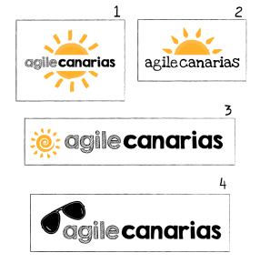 We started testing different versions, using the same concept with a sun as a base, but after talking to Irene Canalís she convinced me to think in another symbol that identify better the group. Yes, we are in Canary Islands, where we have a great weather, but we would like Agile Canarias to be know for something else, doesn’t it?
Irene didn’t like the typography that much because it didn’t look so professional, but the group members liked the idea because it’s related to sketchnoting, and as we are lovers of this way to take notes, so we decide to use it.
After giving a few turns, I arrived to a shape, halfway between an arrow and a paper plane. Because we use arrows continuously to make diagrams I was trying different drawings with this shape, and unintentionally testing one of them reminded me of an airplane, and I though it was a good idea. In some of our workshop we had done games like collaborative origami to help understanding principles about agile methodologies, so it could work. I show it to the group and they voted for it, so you can see the result.
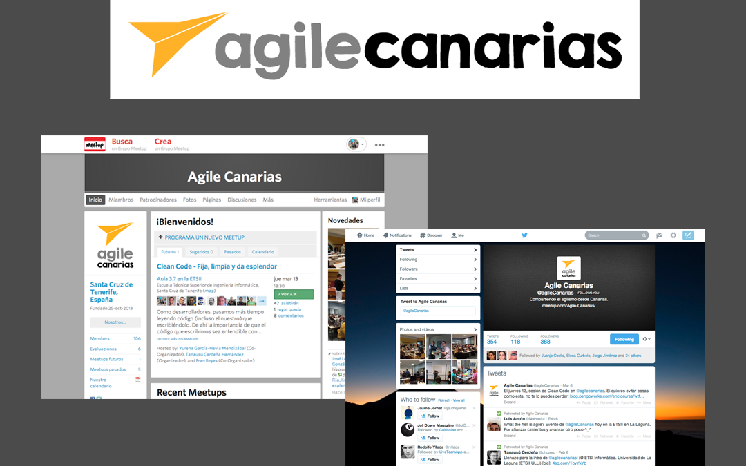
Once the decision were made, I proceed to update our presence in our Meetup and Twitter pages, and I also adapted the backgrounds, header and other components that could be stylish, to match with our current colors. And this is the result:
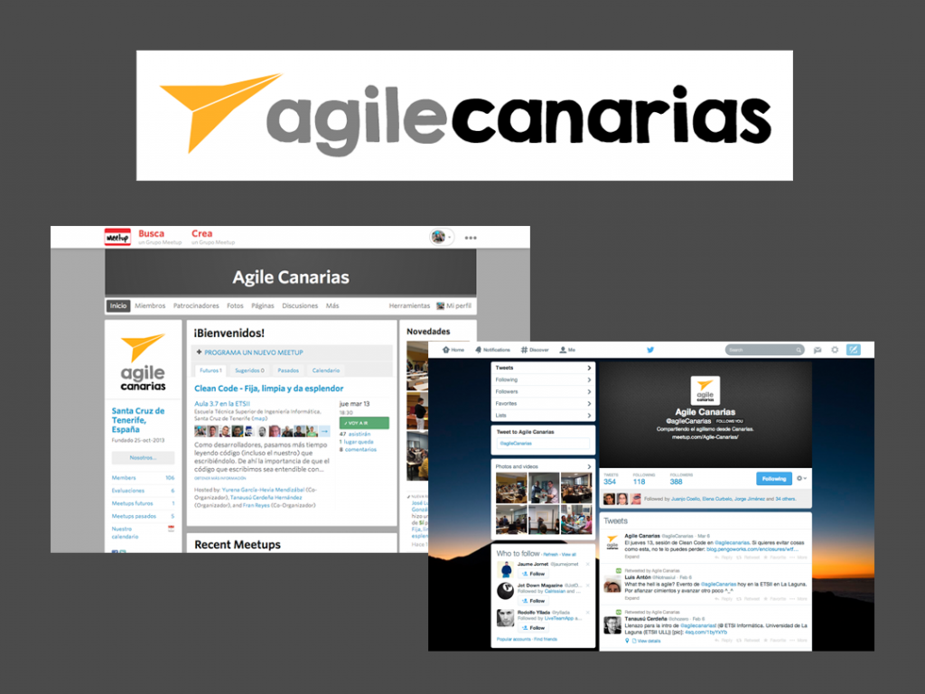 This is what we want to show you, how we change the branding of this group in a couple of hours, so if you want to do something similar just contact us and it would be a pleasure to offer you a perfect solution for your needs 🙂

